About Me

My photo
A collection of material from the design world intended to stimulate conversation, ideas and sharing of new and exciting concepts.

Monday, July 11, 2011

Math + Art = Layout Beauty?

CLASSIC PAGE LAYOUT:
The numbers don't lie- how math and art found form.

<original story>  (RetinArt.com)

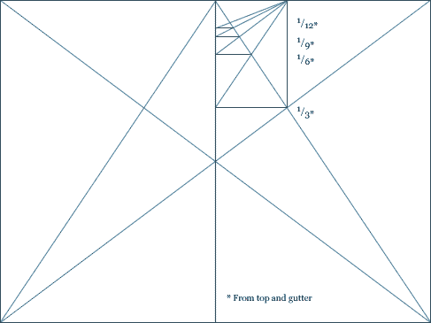
With all the modern tools we have to aide in layout design, it was interesting to get back to the roots of the first prominent book makers and the conventions or canons they used to layout their work. At RetinArt.com there is a great article about several medieval designers who came up with systems which expressed similar ideas, developed independently, forming a familiar pattern of page layout throughout the history of text books. 
      If you have not looked into the Golden Ratio, I'd suggest checking it out- as an artist understanding the mathematical relationship with aesthetic appeal revolutionized the way I design. This method of proportions, represented both in the Fibonacci Sequence and the layout example above (Villard de Honnecourt- 13th century France) provide a subtle framework which can be used as an aesthetically pleasing template time and time again. The beauty of these proportional systems of layout is that you can scale the content to any size, and that content generated in this fashion scales to many sizes. This type of layout is great for today's modern era of cross-media production of similar information, making it easier to layout information across multiple sizes and platforms without losing the aesthetic appeal inherent with the system. 
     As an interesting tid-bit: The Mona Lisa is shown to contain many sections of the the Golden Ratio, as are many classical paintings (mostly associated with religion) from the Renaissance period. This under-written design technique was something like a trade secret, practiced by the masters and executed time and time again in a range of amazing works. 
      If it ain't broke- don't fix it. Check out these useful guides to page layout, add a little stylistic flair and let me know what you come up with! Hope this helps!

DMC Children's Hospital Rebrand #1

DMC Rebrand Project:
Logo Comps
<Facebook photo album>  (facebook.com)

As promised, here is a compilation of the logo rebrand for the DMC Children's Hospital of Michigan. This project will encompass an entire overhaul of the branding from identity to environmental graphics and signage- so be sure to stay tuned as the pieces come together.

Sunday, July 10, 2011

Obama at the DMC Children's Hospital of Michigan


Obama Dominio Art:
Children's Hospital of Michigan
 
The DMC Children's Hospital of Michigan takes a very unique approach to pediatric health care. In their child friendly and
family centered facilities, there are many amazing works of art- those both created for children and by children. As you step off the elevator there is an amazing domino collage of President Obama that really grabbed me as I walked the facility seeking inspiration for a re-branding project. It's both creative and modern, and something that kids and adults alike can appreciate. This is only one example of many fantastic pieces of art that line the walls and help to set a mood within the hospital which is friendly and welcoming.
I have begun a project to re-brand the DMC Children's Hospital of Michigan as a student project. Stay tuned for updates of the creative process and products as they hatch! If you are an artist and have a real passion to make a difference with your work, I believe that donating work to the DMC Children's Hospital could be one of the most rewarding ways for people to actually be inspired by your work- and those are the ones who need it most!

Sunday, July 3, 2011

StockLogos.com- brush the dust off those b-sides

STOCK LOGOS:
Upload and sell unused logos!
<my page>  (stocklogos.com)

After grinding a few weeks of crowd-source design competitions and coming just close enough to get excited and find out that some new design won at the last minute... I was left with a small collection of unused logos. These have been sitting idle collecting dust in the 99 Designs folder for almost two months. I came across Stocklogos.com which is an online market-place that allows you to upload, price and categorize your logos for sale at a 25% fee (you get 75% list price).
If nothing more, this creates a great library of useful graphics to point clients to, and ready-to-go solutions for those rush jobs! There is a template to download and utilize for formatting the logos to upload (an .eps and .png image) and StockLogos places the image on a tee-shirt, hat, coffee mug, shopping back and smart car for application display- it's that easy! I'll be creating my library and sharing along the way.

Monday, June 27, 2011

Text Ideas in Design

INSPIRATION:
Typography loves you back!
<original story>  (enthos.com)

Text Ideas in Design - Turn Typography into exciting designs!

Not only does Entheos (http://www.entheosweb.com) have a great article on Typography, with some stunning examples, there are all kinds of free tutorials, articles, tips and ideas.

Typography is a subtle element which can make a huge impact when done right. If a picture is worth 1,000 words, then a picture of words is worth a cool million.

Saturday, June 25, 2011

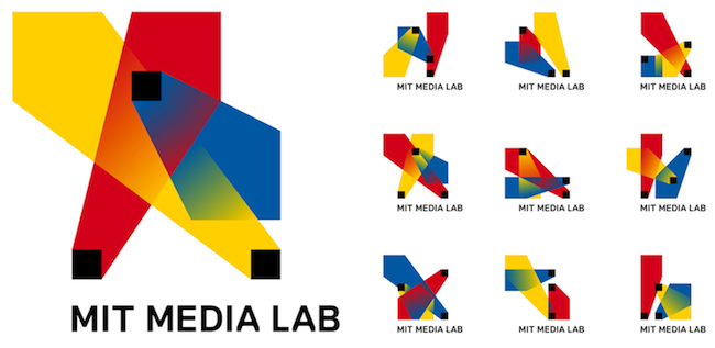
MIT Media Lab Dynamic Logo Algorithm


NEWS:
Dynamic Logo blends art and technology
40,000 Logos generated by algorithm  <original story>  (Fastcodesign.com)


         Leave it to the folks at the MIT Media Lab to generate another compelling example of how the cross pollination of ideas and disciplines can generate some pretty amazing outcomes. My first impression of the concept was "well thats a lot of logos!"- but why do you need a logo that can be represented 40,000 ways in 12 color combinations? Then the genius of the design revealed itself. Each member on the Media Lab staff can select an individual permutation as their identity- providing a whole host of benefits, but most specifically in a place where some of the greatest minds come to play, it provides each employee with the sense of liberation which identifies them as a specialist while adding to the visual representation of the dynamic organization.
        While my feelings on the aesthetic appeal of this brand are only middle-of-the-road, the design really shines when you consider (or are aware of) what it represents. In contrast to the recent Comedy Central re-branding which took a similar sterile, versatile approach, this solution actually helps to build the collective identity of the organization through individuality (networking) of its workers- the people who make the brand.
        I usually look to the MIT Media Lab for fresh ideas and hot new technological concepts- but this time I looked for art. This design is a stunning realization of how art and mathematics- which are about as polar as can be- can merge into a functional and forward design. As an aside, and something I'm sure I'll write more about: Check out this Sixth Sense Technology- demoed by the MIT Media Lab at a TED conference: <link>

Comedy Central gets rebranded


NEWS:
COMEDY CENTRAL REBRAND
Hit the mark? Or too simple?  <original story>  (Fastcodesign.com)


         In a world where all things funny spring and flow free, a new slick, versatile design has made itself home. Thelab, a New York firm responsible for the re-brand, proudly stands by its work amid a growing majority of nay-sayers. Some say it's too corporate, some say it's just not that funny.

         The world of design can be a fickle thing. While the new logo is certainly more versatile and will be able to be applied more dynamically across media ranging from iPads to Television and Movies, there is a little piece of me that died when the funny business (Comedy Central) sold its spirit to the mass media. A brand should first and foremost connect with an audience, it should reiterate the sentiment of its community. It should help to communicate the ideas of the organization as well as its values and personality. Here is where I think thelab missed the mark- while the new logo will be mechanically more versatile (which is good for the network) it is a big jump from the personality infused logo which has represented the brand for so long. From the outside looking in, I get a subtle anxiety that funny isn't gong to be funny anymore- that's it's going to clean up its act, cut its hair and get a 9-5 programming spot that's fun for the whole family.